Tailwind CSS
Posted: May 22, 2022
Responsive Design
Responsive Design Docs : Breakpoint Prefixes: sm, md, lg, xl, 2xl
The Holy Grail
Typical (best practice) web page design practice. A header and footer sandwich the main content of the page. Often the main content will have sidebars that we can refer to as nav on the left, and aside on the right. The areas of a webpage are header, nav, main, aside, & footer.
Talking intelligently about code
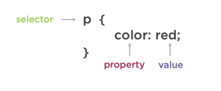
Collectively a property and its value are called a declaration.
Difference between rem & em:
- em unit allows setting the font size of an element relative to the font size of its parent
- rem is based upon the font-size value of the root element, which is the <html> element
Page Layout
Order: classname='order-#'
- order is a child element that defines the order elements appear in (row vs column for responsive design)
FlexBox is a tool that is most appropriate for app components, and small-scale layouts.
Grid layout is intended for larger scale layouts. (And possibly data visualizations?)
Display : Hide an element on mobile: classname='hidden md:flex'
Margins & Padding
Margin: The margin property controls the space outside an element, and the padding property controls the space inside an element.
Sizing
Height : h-{number}, h-px
Styled Components
yarn add styled-components gatsby-plugin-styled-components babel-plugin-styled-components
Hamburger Menu with Gatsby and Styled Components
Importing Fonts
How to add a Google Font to your Gatsby Tailwind Project
Font-Family has several default values which will use the default font related to that value: serif, san-serif, monospace, etm. You can also reference the font name directly.
Reference cssFontStack to research font adoption when choosing fonts.
Styling Text
There are three main properties for text: size, weight (bold), & style (italics).
Font-Style has two similar values, italics as well as oblique. In the purest (type designer) sense, an oblique is a roman font that has been skewed a certain number of degrees (8-12 degrees, usually). An italic is created by the type designer with specific characters (notably lowercase a) drawn differently to create a more calligraphic, as well as slanted version.
It's best to specify an italic only when you're sure that font has been designed with one, so make sure to import the italic version of the font. Some fonts were meant not to be italicized or obliqued... but people did anyway. Operating systems will, upon clicking the 'italic' icon, skew the font and create an oblique on the fly. Not a pleasant sight.
Line-Height or 'leading' is the white space between lines of text. For reading text on desktop devices, the ideal line height of around 1.5 to 1.6. It always depends on your typeface, and the shorter the line, the lower the line height can be, especially for headings.
Letter-Spacing or 'tracking' is the white space between letters.
Text-Align values include: center, left, right, & justify. When using justify make sure to set a max width. The ideal line has a length of 60 to 80 characters.
Text-Transform with a value 'capitalize' will Proper Case the text.
MDX
MDX : MDX makes it possible to include React components in your Gatsby blog posts and pages. MDXProvider

